UX DESIGNER AND STRATEGIST
DESIGNING A TECH COMPANY'S WEBSITE
My company's website was losing visitors and confusing clients. I took the lead to clarify its message, revamp its visuals, and satisfy user and stakeholder needs.
DURATION
5 months
MY ROLES
UX Researcher and Designer; Interviewer; Project Manager
OPPORTUNITY
My company's website was outdated, misrepresented company priorities, and used vague, hard-to-understand language. Over about 5 years, leadership engaged several contractor firms and internal teams to revamp the site, but they fell flat when they did not address these key concerns. The company first approached me to critique contractor work, but I quickly adopted the project.


REQUIREMENTS
In our initial meetings, leadership, sales, and practice leads stipulated that the new website must:
-
Simply and elegantly convey what we do to clients, partners, and lay visitors
-
Function as an attractive tool for the sales team
-
Be updateable by non-technical team members
-
Improve findability of content
-
Be mobile responsive
-
Have a modern, "punchy" look and feel


PROCESS
The company initially wanted a beautiful template with blank spaces to fill in with content and copy. As I discussed website capabilities with key stakeholders, it became clear that much of this content did not exist, and would need to be generated. I conducted interviews with practice leads, technical experts, project leads, and sales to understand their unique needs from a new website. It became apparent that each practice had different priorities and would require a customized design. Each page went through several iterations as we approached a mutually desirable outcome. I tracked my progress through the needed updates, assigned tasks to collaborators, and met regularly with leadership to ensure a satisfactory outcome.
No one has been able to get us here before, and we've tried it 3 or 4 times with contractors or internally. It has always stagnated and felt like fluffy marketing. We're finally getting the voice of the company. It's showing our passion and what makes us unique.
-Head of Sales
OUTCOMES
-
Clear, understandable copy that accurately and simply describes our services
-
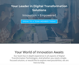
A homepage that emphasizes the company's most important goals, particularly partner relationships and differentiators
-
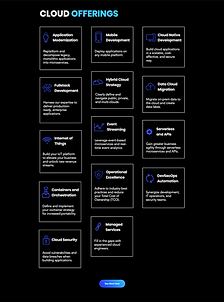
A customized page for every practice, informed by interviews and collaborative design with each practice lead
-
Customized partnership pages, designs and content informed by input from research
-
Impactful, punchy, individualistic visual design according to asks from leadership
-
A page for our resources, white papers, one-pagers, videos, and other materials, organized by category and protected by form fills
-
A contact page, cross-referenced at the bottom of the rest of the pages for easy access, and an updated jobs page
-
A search function
-
Our blog, transferred to the new site, with updated tags and author attributions
Since launching the site in September of 2020, Cedrus has gained both visibility and follow-through from new and old visitors to the site. The company does not currently have a marketing department or staff, so most of this drive upward can be attributed to better search performance and site relevance.


